
Time to rethink the UK’s testing regime for international travel

A data driven look at how well the system is working
Whether you believe that the UK’s international travel restrictions are needlessly burdensome, or you are more worried about the risk of importing dangerous virus variants from abroad, I think everyone can agree that the system should be as efficient and effective as it can be. Wherever you strike the balance between “cost” and risk reduction, we want a system that is both effective at reducing risk and, for any given level of risk reduction, minimises the cost and inconvenience.
The current system was put in place in something of a rush. Some would say that when it was introduced, it might even have been deliberately designed to be expensive and burdensome. The government knew that it was politically impossible to sustain the legal bans, but still wanted to minimise travel.
However, we are moving into another phase. The vaccination programme is now running out of people willing to be vaccinated. We’ve done what we can to protect against hospitalisations and deaths. We are now in the phase of “living with the virus”. That has been recognised in terms of domestic restrictions, but not yet when it comes to overseas travel. It is surely time to take stock of how well the current system of travel restrictions and testing is working and consider what changes should be made. The objectives should be different now - we are not managing an immediate crisis, we are trying to come up with a system that is sustainable over the next couple of years at least. We also know a lot more than we did about the virus and about how well the system of testing is working in practice.
In this article, I’m going to try and examine this issue. As usual, I’ll do my best to anchor my assessments in the data. The government publishes a lot of that, but it can be quite difficult to make sense of it.
Let us start with what the government publishes about overall testing volumes and check that they match up with the data we have from other sources on the number of people travelling.
Reconciling the June numbers
The latest official figures we have about international air travel volumes come from the CAA and are for the month of June. Unfortunately, the CAA don’t split the departures from the arrivals, but overall there were 1.6 million arrivals and departures by air in the month. Normally, these would be split fairly evenly between arriving and departing passengers. Let’s make that assumption for now, which would give us about 0.8m arrivals by air.
If you look at the figures published by NHS Test & Trace, there were 467,306 arrivals from amber and 40,307 from red list countries in the last four weeks of June (June 3 - June 30, data from Table 19). To get to total arrival figures, we need to add in those from green list countries and scale up for the first two days of the month. In the last three weeks of June, green list volumes were about 10% of the amber list number. So we can come up with a fairly reliable figure for the number of people entering the arrivals testing service in June of just under 0.6m ((467,306 * 1.1 + 40,307) * 30/28).
That’s a fair bit lower than our 0.8m estimate, so the first thing to check is whether departures might have exceeded arrivals. The UK air travel market in overall terms is biased towards outbound travel, so you could get departures exceeding arrivals if there was a strongly growing market. We can look at the Test and Trace data for arrivals volumes in the first week or two of July so see whether that is likely (see chart below). The arrivals in the first two weeks of July were actually in line with or even below the arrivals in the first two weeks of June. So it seems unlikely to me that departure numbers were that different from the arrivals and I think it is fair to stick with our estimate for 0.8m international arrivals into the UK.

Source: Weekly statistics for NHS Test and Trace (England), Table 19. GridPoint analysis.
Other adjustments
We have a couple of other things to adjust for to get like for like estimates. The CAA stats are for the whole of the UK, whereas the NHS data is just for England. CAA splits figures by UK airport and 93% of the passenger volume was through English airports, so we can adjust for that. The CAA international figures include 71,000 passengers to/from Ireland, which we need to exclude because arrivals from Ireland are treated as domestic and don’t need to test.
The arrivals testing programme covers non-air arrivals too, which we need to allow for. Based on data from April-June 2019 about the proportion of travel by mode, I think about 8% of UK international arrivals excluding Ireland were by sea or via the Channel Tunnel, so we need to add in an allowance for those passengers too.
Finally, we need to exclude passengers who were making airside transits in the UK, since they don’t enter the arrivals testing system. 816,185 international passengers flew through Heathrow Airport in June, accounting for about half of the UK’s overall volumes in the month. If 30% of those passengers were making a connection, that’s about 250,000 passengers that we need to exclude from the CAA figures.
After making all these adjustments, we get a figure derived from the CAA stats of 0.6m international arrivals entered the English test and trace system. That matches the figure we got from the Test & Trace data.
So the overall figures from Test and Trace look good. The system is capturing all the arrivals at the start of the process. That shouldn’t be a surprise, since it is impossible to board a flight to the UK without filling in a passenger locator form on the government’s own site, and that is the source of the arrivals data.
But as we will see, things go downhill from here.
Volume of tests
It should be the case that everyone arriving from a red list country takes a day 2 test. If they test negative, which 98.4% of them do, they should also take a day 8 test. The government has started giving us figures for the volume of each type of test taken by people quarantining in a hotel. I put them on a chart.

The grey line shows the number of people starting their hotel quarantine in any particular week. The red line shows the number of day 2 tests. Since “day 2” actually means “on or before day 2”, these lines should track each other closely and they do. There is some evidence that day 2 test volumes were not keeping up during May and the first part of June, with a catch-up happening in July. That suggests that “day 2” might well mean “day several”.
Even more striking is what is happening with the blue line, the day 8 test volumes. In timing terms, they should be shifted to the right by about a week and that seems to be what is happening. But there are far fewer tests than there should be. On average only 72% as many day 8 tests as you would expect, even after allowing for the positive day 2 tests. This amounts to about 2,500 missing day 8 tests a week from hotel quarantine.
The testing for the hotel quarantine programme is totally administered by the government. You are only supposed to be released from quarantine if you test negative at day 8. The rules are quite clear on the government site:
“You will need to take a COVID-19 test on or after day 8, unless you received a positive result from your day 2 test. If you receive a positive test result from your day 8 test, you will be required to continue your quarantine period restarting the 10-day count beginning the day after the test.”
So how is it possible that 28% of people are apparently ending their quarantine without taking the day 8 test? Whilst it would be a big scandal if that was actually happening, it seems more likely to me that what is going on is that test providers are failing to deliver the day 8 tests on time, or to return the results quickly enough. We know there have been big delays and outright failures from some providers. My guess is that hotel quarantine managers are allowing people to exit quarantine if they test negative using a test that is “outside the system”. Maybe even one of the free NHS rapid antigen tests that you are not supposed to use for travel.
In any event, the impact is that the government doesn't seem to have the data for more than a quarter of the day 8 tests for red list countries. Far from ideal.
What does the situation look like for people arriving from amber list countries?
Amber list test volumes
Here is a chart of the same data for arrivals from amber list countries. The government data refers to these people as “quarantining at home”. That was never a very accurate description, since by definition any non-UK residents would not be quarantining at home. It is even less appropriate now, with double vaccinated people able to skip self-isolation and the day 8 test since July 19.
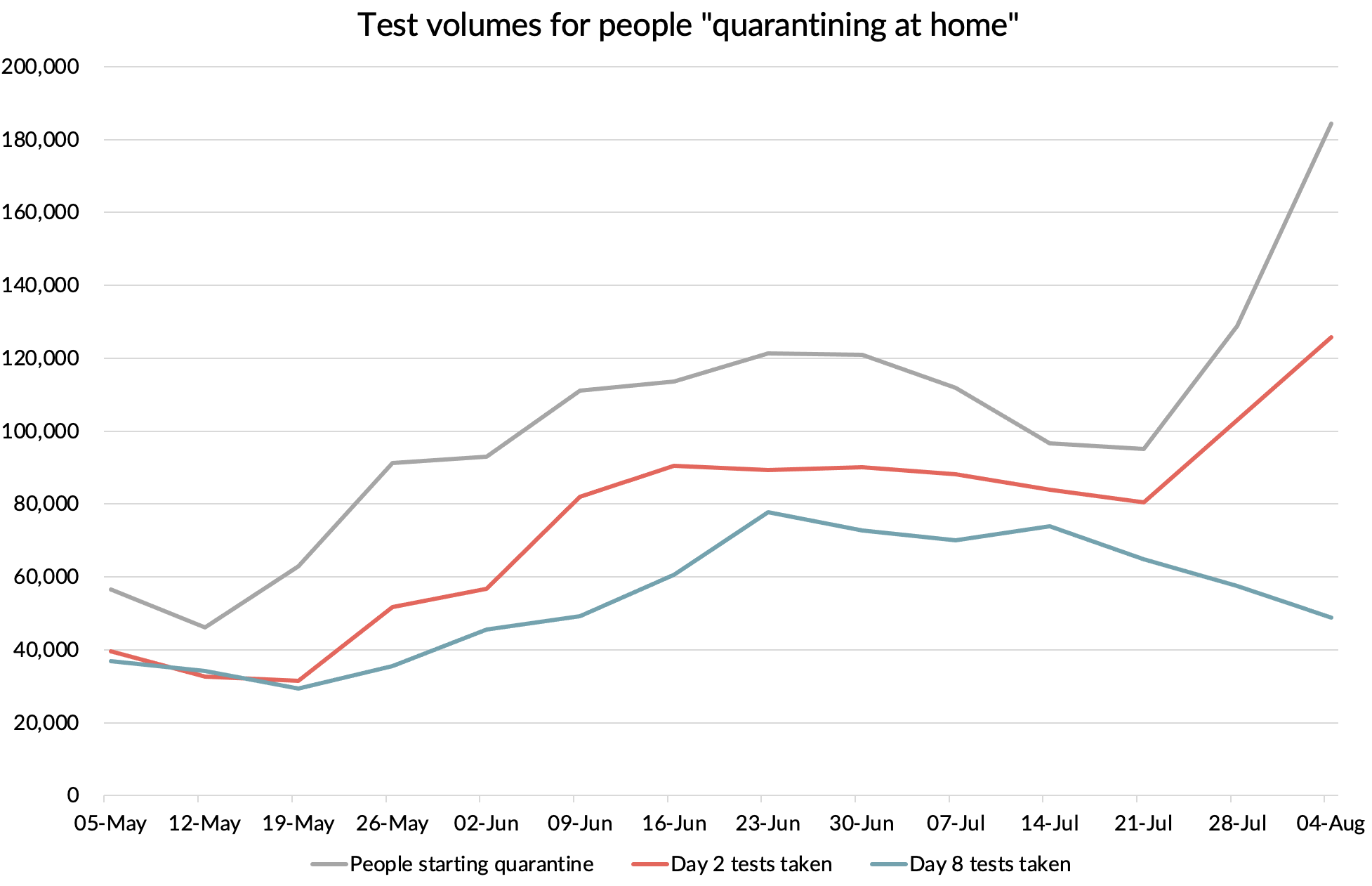
Source: NHS Test & Trace (England), GridPoint analysis
You can see that for most of this period, we seem to be missing about a quarter of the day 2 tests you’d expect. In some cases, perhaps these are people who are doing a one to two day trip to the UK and never take their day 2 test. Or maybe they are just rebelling against the system.
The situation is even worse for day 8 tests. About 15% fewer day 8 tests were recorded than the day 2 volumes during the May 26 to July 14 period. That means 41% fewer day 8 tests than we should have, or about 42,000 a week. Again, some of this will be travellers who weren't even in the country on day 8, having already finished their visit. But there are relatively few reasons to want to visit the UK for a few days spent in self-isolation. Is this evidence of mass non-compliance? Or is the data just screwed up again?
The other interesting thing we can see from this data is the drop in day 8 testing volumes from the week ending July 21 onwards. That will be due to fully vaccinated people not needing to self-isolate or take the second test with effect from July 19.
Unregistered tests
Part of the explanation for the missing day 2 and day 8 tests could be a category the government calls “unregistered tests”. The registration process is where the traveller goes to the test provider site, provides the serial number of the test and fills in their details, including where they travelled from. The fact that we apparently have a huge proportion of tests where this has not happened is a big issue. It is a problem which seems to have been getting worse in recent weeks.

Source: Weekly statistics for NHS Test and Trace (England), Table 20. GridPoint analysis.
Where are all these unregistered tests coming from? The government forces you to buy an arrivals test package. You can’t get on a flight without completing your Passenger Locator Form (PLF). You can’t do that without giving the government a valid test booking reference number from a test provider.
It would be easy to imagine that many people are just not taking the tests, worried about testing positive and being required to self isolate, or just rebelling against the system. I don’t know how effective the follow up is for people who fail to send off the test. But the government includes the unregistered tests in its definition of tests which have been “processed” and even tells us how many of them tested positive (about 1%). So it does look like these are tests that have been processed by the labs. But for some reason the government can’t identify what kind of test they are. “Unregistered” suggests that the traveller has failed to go on the test provider’s website to register the test and provide all their details, including what kind of test it is and where they were travelling from. If the problem was small, then that might make sense. People don’t like filling in forms. Many travellers may not even speak English. But 43% of tests? That doesn’t pass the common sense test.
It seems more likely that the data is being provided by the traveller in most cases but is disappearing into a test-provider black hole and is never being passed on to Test & Trace. The labs that process the physical samples are certified or in the process of obtaining that certification. They are probably legitimate and trustworthy 🤞. That data seems to be getting through to the government. But the data processing side of the business which handles test registration and other customer data seems to be in the hands of a wide variety of resellers, many of which have been set up during the crisis with not very reassuring names like “0000Covid 19 private test Ltd”. Despite being promoted on the government’s own website, a lot of them look like cowboys to me. I wrote about the issue here.
Here is a chart of the volume of day 2, day 8, test to release and “unregistered” tests per person quarantining at home. The unregistered tests are probably the missing day 2 and day 8 tests, mixed up with “test to release” tests. It also looks like the huge volumes in late July actually relate to earlier periods, since you’d expect tests per traveller to be somewhere between 2 and 3, depending on how many people elect to take the optional D5+ “test to release” test.
What a mess.

What to make of all of this
The new health secretary, Sajid Javid, has asked the Competition and Markets Authority to investigate the pricing policies of private test providers, with inflated prices and misleading advertising. When it comes to service delivery, pictures have been circulating online about overflowing drop-boxes and there are many reports of test kits taking many days to arrive, or simply failing to turn up at all.
Based on what we have seen from the testing data, I think we can add data management as another area where the system is failing dismally and seems to be in a state of disarray. For a system whose primary purpose is to provide decision makers with high quality intelligence on travellers arriving in the UK, that is a big issue.
One of the most striking things about the UK’s arrival testing data is the number of tests for which the origin country is not known. That’s the case for 26% of arrival tests for the most recently reported country level data (three weeks to 21 July).
After I drew attention to the huge volume of “unknowns” in an earlier blog post back in June, the government added the following note to the next set of data they published, which came out on 24 June.
“Due to an issue with the underlying data, the number of people tested whose recent travel destination is classified as unknown may be counting individuals who did not travel. We have identified the cause of the issue and are looking to resolve as quickly as we can. Tests that are assigned an unknown recent travel destination do not impact the JBC's evaluation of Risk Assessment Status of any individual country.”
This note has remained unchanged ever since. It is now almost two months later.
We’ve already seen that the overall arrivals testing volume data (which include the unknowns) line up well with the overall travel volumes reported by the CAA. It seems extremely unlikely to me that the tests where the country of origin is unknown are associated with “individuals who did not travel”.
I think the root cause of the problem is more likely to be the unregistered tests. They made up 36% of tests in the three weeks to 21 July. That doesn’t tie up exactly to the unknown percentage, but it is of a similar scale. Since one of the main purposes of the system is to monitor arrivals to inform policy decisions on which countries to put onto which risk list, not knowing which country the traveller is coming from in so many cases is a real problem. And remember, the problem is getting worse, not better.
So, there are many deficiencies in the quality of information being provided to decision makers. What can we say about how good a job it is doing in terms of preventing infections being imported into the country?
How many cases are being detected by the system?
The first line of defence of the testing system is the pre-departure test. How many people pass or fail the test is not something the government collects any data on as far as I know. They certainly don’t publish it if they do. The airlines don’t seem to know the figures either. I tried asking the testing companies, but they won’t disclose the figures. I didn’t really expect them to as they have no interest in putting the COVID testing gravy train at risk by releasing any data which might lead to a change in policy.
We can sneak up on the pre-departure figures by extrapolating from the arrivals results that we do know. The reason for people testing positive post arrival having tested negative pre-departure is mainly down to the difficulty of detecting early stage infections with tests. A pre-departure test done a couple of days before departure won’t pick up infections which happened just before the test. They will also miss any infection that happens between taking the test and arriving in the UK, whether that is before or during the journey.
British Airways and American Airlines ran a trial back in late 2020 and early 2021 for travellers from the USA. The trial used a PCR test done up to 72 hours before departure, a LAMP test immediately after arrival at Heathrow and a PCR test between day 3 and 5. The results showed that 1% of travellers tested positive on the pre-departure test. Of those who tested negative and travelled, none tested positive on arrival at Heathrow and 0.3% of the conclusive results for the third PCR tests were positive. So the pre-departure PCR test caught 77% of passengers who would test positive by day 3-5. It can take up to 10 days for someone to test positive after infection, so the BA/AA trial may have missed a few infected passengers.
We have another reference point from a study carried out in Canada. I wrote about that here. That study suggested that a single PCR test of air travellers would catch 62% of people who would go on to test positive at some point in the next 14 days.
The UK allows PCR, LAMP or antigen/LFD to be used for the “fit to travel” test, provided that the test meets a minimum sensitivity of 80%. Most people use an antigen / LFD, which is both cheaper than a PCR and gives faster results (see following chart). Let us assume that the average sensitivity of the test compared to PCR is 85%, so 15% of cases that would be positive on a PCR test will be missed. Using the Canada reference, that gives us an estimate for the proportion of infected people caught by the UK’s pre-departure test of 53% (62% x 85%).

Source: Twitter poll. N=201.
How many people are testing positive on arrival?
The day 2 test positivity for amber routes hit a low of 0.3% during the second half of May and the first half of June. That coincided with the waning of the “Alpha wave” in Europe and preceded the rise of the “Delta wave”, but day 2 test positivity was as high as 2.4% back in early April. Adding in the peak test positivity of 1.3% at day 8 (which happened one week later, as you would expect), gave us a peak arrivals positivity of 3.8% (2.4% + 1.3% = 3.8% due to rounding).

Source: Weekly Test and Trace statistics (England), GridPoint analysis
If the pre departure test was catching 53% of cases, that means that at the peak, without the pre-departure test, 8.0% of people would have tested positive (3.8 / 0.47). At that time, India and Pakistan were on the amber list and made up almost half of the people testing positive on arrival. The test positivity of arrivals from India was almost double the rate for the amber list overall. That shows quite how high infection rates must have been in those countries at the time - something like 16%.
In the following chart, I’ve shown the overall test positivity for the amber list routes and what it would have been without the pre-departure test (the “unmitigated” line). As a comparison, I’ve shown the equivalent figures for community infections in England at the time. I’ve taken these from the ONS survey data, but to get comparable numbers, you need to make a similar adjustment - allowing for the fact that early infections will be missed by the ONS survey too. The ONS use a PCR test, so you need to gross up the figures by the 62% figure to get the proportion of people who would test positive, or would have gone on to do so if isolated from that point forward.

Source: NHS Test and Trace (England), ONS prevalence survey, GridPoint Analysis
You can see from this that when India and Pakistan were on the amber list and infection rates in the UK were low, it was correct to treat arrivals from amber list countries as higher risk than an average person in England at the time. That is despite them all having tested negative pre-departure. With India and Pakistan moved onto the red list and infection rates falling in Europe, that ceased to be the case around the end of May. As the Delta wave caused cases to rise in the UK and in many other countries, the risk of amber list arrivals being infected rose, but not as fast as it did in the UK. We are actually now at a point that you could do away with the pre-departure test and travellers would still have a similar level of infection as a randomly selected person in England. With the pre-departure test in place, they are about half as likely to be infected.
We can draw the same chart for the red list countries. Note the slightly different scale on this chart. We see the positivity rate jump as India and Pakistan are switched across. But interestingly, with case rates having fallen in many of the red list countries, the likelihood of an arrival from a red list country being infected is now also lower than a random chosen person in England. The pre-departure test is doing its job of bringing arrivals rates down below community infection rates in England at the moment.

Source: NHS Test and Trace (England), ONS prevalence survey, GridPoint Analysis
The red list is of course not just about the risk of importing generic cases, many countries are on that list because of “variants of concern”.
The government has defended the need for day 2 PCR tests for all travellers based on the need to spot variants of concern getting into the UK at the earliest possible moment.
How good a job is the system doing at that?
Variants of concern
Here we have another puzzle. For a system designed to identify variants, remarkably few tests are sent for sequencing. The government says it sends every positive day 2 test for sequencing if the viral load is sufficient to do that. What proportion does it manage to sequence in practice? In the early days after the system was introduced, they did pretty well, sequencing 80-90% of the positive day 2 tests. But that has been in continual decline, reaching a low of only 13% in the latest three weeks of data.

What is going on? Is the policy not being followed? Is the data screwed up? Both are possibilities.
Another issue may be falling viral loads in the positive samples being collected. You can only sequence a sample if the viral load is high enough. To be honest, it is a little surprising that any of the positive samples can be sequenced. The rapid antigen tests used before departure should only miss low viral load cases, so by screening out high viral load passengers, you have almost guaranteed that any arriving passengers who test positive only 2-3 days later will have low viral loads, which you won’t be able to sequence. Only samples with a Ct-value below a certain threshold (about 30) are sent for sequencing.
What is perhaps puzzling is that such a high proportion were sequenced early on. At the start, all testing was done by government labs, but now almost all of the Day 2 tests are done in private labs. The private test providers have to bear the cost of sequencing, so maybe the Ct-threshold they are using to identify cases to send for sequencing has been “nudged down” to reduce the cost?
There may also be an effect due to vaccinations. We know that any vaccinated people who become reinfected have lower viral loads on average (the peak is the same, but it comes down faster). Maybe an increase in the mix of such cases is having an impact?
Whether it is an issue with viral loads, test provider policies, or just a data issue, what can’t be denied is that a system which only gives you data on 17 sequenced samples a day is not a very useful tool for picking up variants of concern entering the country. Especially when the government doesn’t know what country they came from in many cases. In the most recent three-week period, the system detected not a single variant that they were worried about. Almost all were Alpha and Delta variant cases.
What are other countries doing?
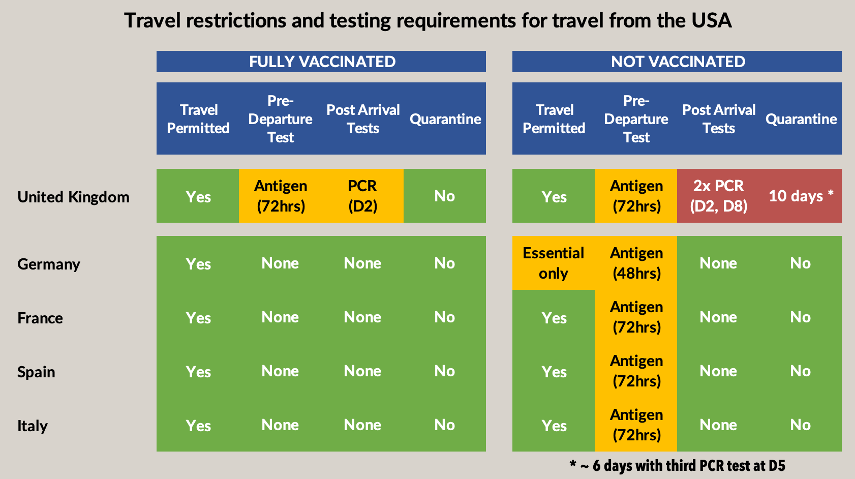
I did a quick comparison of the policies for travellers coming from the United States. I used the US, but it is similar picture from most countries that the UK has on its amber list. Here is how the UK compares. You can see how much more restrictive the UK is being, even after the recent change to allow fully vaccinated passengers to avoid quarantine and the day 8 test when travelling from amber list countries.
These restrictions and onerous testing requirements are having a real impact on travel. Here are the figures on flight numbers at what is normally the “peak of the peak” travel season. You can see how much the UK is lagging these other countries.

Source: Eurocontrol
The verdict
Rather than just fiddling with the cost of the arrivals tests, I think the government needs to stand down its programme of mass PCR testing of arriving passengers. It can only be justified for higher risk countries, i.e. the red list. For other countries, it is simply not delivering anything useful and it is doing so at huge cost and inconvenience to travellers.
The pre-departure test should be dropped for the lowest risk countries and travellers. I’d support getting rid of it completely for green list countries and dropping it for fully vaccinated travellers from the amber list. Even with these changes, arriving passengers will be no higher risk than the general population, and probably lower.
These changes, together with an ongoing process of revisiting the classifications in a timely way as risk levels change, would go a long way to allowing travel to get back to something closer to normality, without in my view increasing risk in a material way.
This might sound like a radical and risky policy change, but it is no different than is already in operation in most other developed countries. It is time the UK stopped trying to demonstrate the superiority of its “world-beating test system” by being a complete outlier in terms of its approach to travel. The reasons the government gives for keeping the system are ringing hollow in the face of the data which shows how little value is being added, at a huge cost to travellers and the travel industry.