
Reverse engineering the travel restrictions algorithm
Last Thursday, the UK government revealed the third iteration of the traffic light classifications which govern the restrictions on overseas travel.
There has been much criticism from the industry that the logic for which countries get put onto which list is not at all clear. Feelings are so strong that a number of airports and airlines have launched a court case over the issue. Whenever Grant Shapps is challenged about that, he insists that they are being fully transparent, publishing all the data that is being used to make the assessments. On Friday, they published the data corresponding to the latest changes.
There are two main problems. Firstly, the government won’t say how it uses the data to reach its decisions – we have the data but don’t know the algorithm. Secondly, the data is only provided for countries where classifications change. Most of the challenges from the industry are about why countries didn’t change classifications, in particular why so many countries seems to be stuck on amber or red.
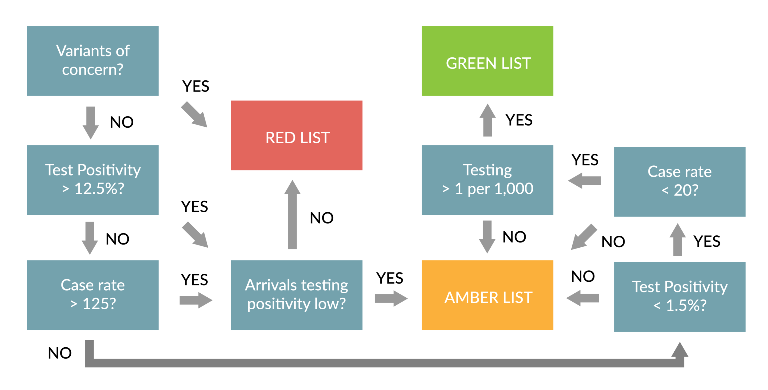
It is possible with a bit of effort to find the equivalent data for countries which didn’t change status, since all of it is published in some form elsewhere. Despite my suspicion that there really isn’t a consistent algorithm being used, I put in the effort to fill in the missing data. In this post, I’m going to see if I can find some kind of logical algorithm which would explain the decisions. Not only the changes of status, but also the decisions to keep the status unchanged.
Let’s get started.
The big two – case rate and test positivity
We know that case rate and test positivity are the two most important parameters. For example, they form the basis of the system being used by the EU to classify country risk. In theory, you only need the case rate to tell you what proportion of the population are infected. But widely differing rates of testing makes this unreliable as a single metric. A lower testing rate will mean that more cases are missed. The proportion of tests which are positive is therefore another good measure. Assuming that at least some minimal level of testing is taking place, getting low scores on both metrics is a good indication that the real infection levels are low. A high score on either metric signals the opposite.
Of course, there are other reasons why a country might be on the red list. The main one is the presence of variants of concern. We’ll come back to that later, but first let’s try and get a sense for what thresholds for “the big two” might be considered low enough to avoid triggering a red classification.
Here is a scatter plot of all the amber and red countries, following the latest review. I haven’t labelled all the data points, but I’ve done so for the five biggest “amber outliers” - the amber list countries with the highest case or test positivity rates. These should give us a good idea for the maximum acceptable rates to avoid the red list.

You can see that there are no countries on the amber list with a test positivity of 25% or more. Above 12.5%, there are only two, Mexico and Guatemala. When it comes to case rates, there is only one amber list country with a rate above 125, which is Kuwait.
For both Mexico and Kuwait, there is some data from the UK arrivals testing programme, which the government says it is using as one of the data sources behind its decisions. 110 people from Mexico and 209 from Kuwait were tested on arrival into the UK between May 20 and June 9, and there were no positives. Maybe that is giving the government confidence to keep these countries on the amber list? These are both countries where the richer people who fly have access to vaccines in a way that poorer people don’t, so there is a logic for why the overall case numbers in the country might not match the risk of travellers being infected.
The same can’t be said for Guatemala, where no travellers arrived in the UK during the period. Perhaps it is this absence of travel that lies behind the decision to keep it at amber?
Leaving aside the outliers, it looks like either a test positivity of over 12.5%, or a case rate of over 125 will get you rated as red. So let us take that as the first rule for our reverse engineered algorithm. But we’ll also do a check of the data from the UK’s own arrival testing programme, and if it is reassuring enough, this rule can be overriden.
How would our “proto-algorithm” work in explaining the changes that have been made so far? Let’s start with the latest additions to the red list.
Red list additions
Six countries were added to the red list on June 24. I’ve shown the case rate, test positivity and the key traveller testing data for these below. The government suppresses the data for the number of people testing positive whenever it is less than three, so we can only calculate an upper bound for test positivity in those cases.
Country |
Case Rate |
Test Positivity |
Travellers Tested |
Traveller Positivity |
|---|---|---|---|---|
| Dominican Republic | 71 | 20.5% | 98 | 6.1% |
| Eritrea | 11 | no data | 13 | <15.4% |
| Haiti | 8 | 25.1% | 3 | <66.7% |
| Mongolia | 335 | 15.1% | 4 | ≤50% |
| Tunisia | 113 | 27.5% | 213 | 3.8% |
| Uganda | 20 | 15.1% | 412 | 4.1% |
All but one of these look like they were added due to high test positivity rates (above 12.5%), even though in some case the reported case rate was quite low. The traveller data wasn’t reassuring enough to grant a Mexico style “get out of jail free” card.
The country that doesn’t fit the rules was Eritrea, although no real data seems to be available. It shares a large land border with Ethiopia, which had been on the red list since March 19, so maybe that was the reason it got added.
Now let’s look at the seven countries added at the previous review, announced on June 3.
Country |
Case Rate |
Test Positivity |
Travellers Tested |
Traveller Positivity |
|---|---|---|---|---|
| Afghanistan | 7 | 12.3% | 146 | <1.4% |
| Bahrain | 1,040 | 12.6% | 79 | 3.8% |
| Costa Rica | 320 | 26.1% | 31 | <6.5% |
| Egypt | 8 | 16.8% | 167 | 4.2% |
| Sri Lanka | 101 | 12.2% | 49 | <4.0% |
| Sudan | 1 | no data | 51 | <3.9% |
| Trinidad and Tobago | 254 | 27.9% | 9 | <22.2% |
Our “rules” can explain Bahrain, Costa Rica, Egypt, and Trinidad & Tobago based on test positivity and/or case rate. The UK arrivals testing data available at the time wasn’t reassuring enough to rescue them either.
Afghanistan and Sri Lanka were borderline on our 12.5% positivity threshold. But they also will have had concerns about variants. The Delta variant was reported to be circulating in Afghanistan in media reports from May 27. Sri Lanka’s proximity and close links with India would have made it a natural concern. Likewise, Sudan announced two new variants on May 24.
So we seem to be doing reasonably in explaining the last two sets of red list additions. What about the countries that were added to the red list in earlier periods? Can we explain why they are still there?
Red list countries that don’t “fit the algorithm”
There are 27 red list countries which had case rates below 125 per 100,000 and test positivity below 12.5% in the data for the most recent reference period. We’ve already discussed two of them, which were added in the most recent review.
The most notable of the countries which don’t now fit the rules is India, since reported case rates have dropped substantially. But there is of course still a high prevalence of the Delta variant, which was first identified there. 56% of positive samples from travellers were the Delta variant. Pakistan is another member of this group, and also has a 11.5% Delta “detection rate” for passengers arriving from there.
Qatar is also in this category. It is there because of its role as a “super-connector” hub, with the perceived risk that brings. The UAE was also added to the red list for the same reason, although its case rate at the moment would put it there anyway.
Another high profile case is Turkey, which had a case rate of 50 and a test positivity of 2.7%. Only 1.2% of passengers arriving into the UK tested positive. I had thought it might get moved to the amber list, but that didn’t happen. Maybe it is Istanbul’s role as a transit hub that is keeping it on the red list.
The other countries in this category have very low testing rates, so I assume the government just doesn’t trust the data.
So, I think we can make reasonable sense of the red list classifications. What about the green list?
Green list additions
There were sixteen countries added to the green list at the last review. Here is some of the more useful data for these.
Country |
Case Rate |
Test Positivity |
Travellers Tested |
Traveller Positivity |
Vaccinated per 100 |
Sequences at GISAID |
|---|---|---|---|---|---|---|
| Anguilla | 0 | 0.0% | 9 | <22.2% | 60.8 | 5 |
| Antarctica | no data | no data | <3 | ? | no data | no data |
| Antigua and Barbuda | 0 | 0.0% | 505 | <0.4% | 35.6 | 1 |
| Balearic Islands | 20 | 1.1% | no data | no data | 65.9 | 1,220 |
| Barbados | 2 | 0.2% | 435 | <0.5% | 30.6 | 23 |
| Bermuda | 5 | 0.0% | 210 | <1.0% | 64.0 | 40 |
| British Indian Ocean Territory | no data | no data | <3 | ? | no data | no data |
| Cayman Islands | 8 | 0.4% | 127 | <1.6% | 71.4 | 9 |
| Dominica | 1 | 1.5% | 23 | <8.7% | 27.9 | 0 |
| Grenada | 0 | 0.0% | 38 | <5.3% | 16.4 | 7 |
| Madeira | 13 | 0.2% | no data | no data | no data | no data |
| Malta | 2 | 0.1% | 701 | <0.3% | 77.0 | 218 |
| Montserrat | 0 | no data | 11 | <0.2% | 27.8 | 0 |
| Pitcairn Islands | no data | no data | no data | no data | no data | no data |
| Turks and Caicos Islands | 0 | 0.0% | <3 | ? | 53.6 | 0 |
| Virgin Islands (British) | 20 | no data | <3 | ? | 40.5 | 10 |
For a government who are “following the data”, there is quite a lot of missing data here. There are three new green list additions for which the government admits it has no data.
The Pitcairn Islands: apparently the least populous national jurisdiction in the world, with just 47 permanent inhabitants. So maybe they just rang them all up and checked that none of them had COVID.
British Indian Ocean Territory: no permanent inhabitants and occupied only by about 3,000 British military personnel.
Antarctica: everybody’s favourite summer break destination
There is at least some data for the other 13 new additions to the green list. Almost certainly, the most important criteria are the case rate and the percentage of tests which are positive.
The highest case rate in this group was 20 weekly cases per 100,000. Both the Balearic Islands and the British Virgin Islands hit that threshold. This was the same rate that was used last year as the threshold for not needing to quarantine. Portugal had a case rate of 33 when it was added to the green list and Iceland’s rate was 27, but maybe they’ve tightened up their criteria since then.
What about test positivity? The highest rate amongst the new additions was Dominica, with 1.5%. The Balearic Islands had 1.1%. So maybe 1.5% might be a threshold here.
For all that the government has talked a lot about vaccination status, Grenada made it onto the list with only 16.4% of people vaccinated. As far as sequencing capacity goes, plenty of these countries hadn’t really uploaded anything to GISAID.
We do know that the government is concerned about testing rates. Although I didn’t include the data in the table above, the country with the lowest testing rate was Dominica with 1 per 100,000.
So, I’m going to postulate the following thresholds for green list status, based on these latest additions:
Case rate at or below 20
Test positivity of 1.5% or less
Testing rate of 1 or more per 100,000
Vaccination rate of at least 15%
Let’s look for other countries that meet all these thresholds. There are 22 on the amber list, most of which are in Europe:
Austria, Azerbaijan, Bulgaria, Czech Republic, Denmark, Estonia, Finland, France, Hungary, Italy, Lebanon, Liechtenstein, Lithuania, Luxembourg, Moldova, North Macedonia, Norway, Poland, Romania, Slovakia, Taiwan, Vietnam
About four of these have low numbers of sequencing uploads to GISAID, but so do several countries that are on the green list. None of them have any worrying figures from the arrivals testing programme. In fact, there were 19 positive tests in total from this list of countries detected during the latest three-week period, a test positivity rate of 0.2%. No variants of concern were found from arrivals testing.
Why are these countries being rated as amber?
Let me give you just one example from this group. Italy had a case rate of 20 and a test positivity of 1.0%. The testing regime was pretty good, with 21 per 100,000 tested and 33,085 sequences uploaded to GISAID. 49% of people had been vaccinated. There were only 3 positive tests from the 1,230 people who were tested on arrival into the UK over the latest three-week period.
The only item on the government’s list of criteria that could explain why they are being kept at amber would be related to variants. The following graphic shows the mix of variants in 14 of these “I don’t know why they aren’t green” countries. I’ve included the UK at bottom right for reference. The charts are sourced from covariants.org and if you are interested in the detail, I’d recommend going there. But all you need to know for now is that the red segment is the old home-grown Alpha variant, that has been dominant in the UK and much of the world for more than six months. The new all-conquering Delta variant is in green. I find it hard to explain why all these countries would be kept off the green list due to concerns about variants.

So what’s the conclusion from all of this?
This has been a long post, for which I apologise.
I’ve tried really hard to come up with a logical framework, based on the data the government says it is using, which explains which countries are in which categories. I can just about do that for the red list, although I do feel it is a bit of a one way street. Once a country is on it, it seems to stay there even if the facts change.
Explaining why some countries are on the green list isn’t too hard. They have low case rates, low test positivities and decent levels of testing. The data from the UK arrivals testing programme is very reassuring. Some, but not all, have high levels of vaccination and upload data to GISAID. But these last two tests don’t seem to be that important, based on the countries which have made it onto the list.
But the big thing that I cannot explain is why a whole raft of other countries are on the amber list, rather than the green one. There seems to be nothing in the data the government says it is using that explains why they are languishing on the amber list at this point.
I’m sure the answer is politics somehow, but there doesn’t even seem to be any obvious political logic for why two apparently similar countries get classified differently.
If anyone has any good theories, please let me know. Even better, I’d love to hear the government or their advisors explain what it is that I am missing.
Maybe we will see that justification at some point in the court documents.